|
|
Fly'n "W" This is not necessarily a bad ad, but it's definitely a bad idea, and bad ideas tend to pop up in direct correlation to the number of companies making bikes. Companies try to distinguish themselves from other bikes by trying to make theirs look different and original, but a hideous frame is not the route to take. Fly'n W's bike has got to be the ugliest piece of shit I've seen since the original luggage rack-equipped Vector freestyle bike -- even worse that the MCS Styler (and if you remember what that monster looked like, you know it's bad -- and remember that dorky kid doing a Miami hopper in the MCS ad?)
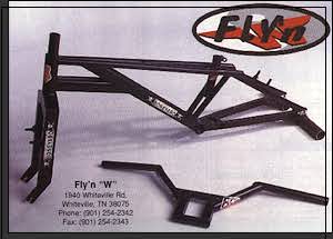 The Fly'n W Boneyard not only takes a prize for the worst graphics and company logo (Ketch put up a good fight, though), but hands-down wins for the ugliest frame. I don't care if it's strong -- I'm even embarassed to LOOK at this bike, never mind ride one! Square-tubed forks and tubing? I don't like the idea of a sharp-edged down tube -- just seems like something begging to whack your shin (and cut it wide open). And is it just me, or does this frame look like the result of a blind guy trying to make an SE Quadangle? |
|
|
page 5 of 6 |